
Bubble charts are a great way to pack more information in your plots. You can display three or even four dimensional data in a simple planar scatter plot. Besides the xy position of the point, you can encode a third dimension in the size of the disk (the bubble), and potentially a fourth dimension in the colour of the bubble.
In this way the chart is still going to look great on the screen or paper, without having to resort to surface plots or the like. In addition, bubble charts are great if you are looking at producing interactive visualisations, where the user can zoom in/out of the chart, or click on the elements to visualise additional information.
In this post we are going to show how to produce an interactive bubble chart with Python, using matplotlib and mpld3. As an example, we will plot the median house price vs the median wage in the Australian capital cities. The population of each city will be encoded in the bubble size, while its colour will represent the ratio between the median house price and the median wage.
OK, don’t worry if you lost me already. We will work everything out step by step. Let’s start with the data. The source of the median house price is an article appeared on the Financial Review on 21st April 2016 available here. Median wage and population of the capital cities is taken for the Australian Bureau of Statistics available here. We have collated the data in a csv file, and we are ready to start.
Step 1: imports
from pandas import read_csv  # to read the data
import matplotlib.pyplot as plt # to plot the data
from matplotlib import colors # to color code the bubbles
import mpld3 # to produce the interactive plots
import numpy as np # always good to have it :)
Step 2: reading the data. The headings of the csv file contain the name of the cities. That is going to populate our “labels” list. We will create more complicated labels later on, but for the moment, let’s go with this:
data = read_csv('data.csv')

labels = list(data.City) # read name of the cities
med_house_price = list(data.Median_house_price) # median house price
population = list(data.Population) # population
med_wage = list(data.Median_wage) # median wage
Step 3: a little data processing. We are going to calculate the ratio between the median house price and the median wage, which we will later use to define the colour of the bubble. Also, we calculate the area of the bubble by a number that is proportional to the population of each city. We just decided to divide the population figures by 500 because it looks better in the chart. OK, here we go:
ratio = list(np.array(med_house_price)/np.array(med_wage))
area = tuple(np.array(population)/500)
Step 4: let’s make a bubble chart with matplotlib. We are going to make a scatter plot, then we’ll customise the size and colour of the dots.
fig, ax = plt.subplots(subplot_kw=dict(axisbg='#EEEEEE'), figsize=(12, 8))
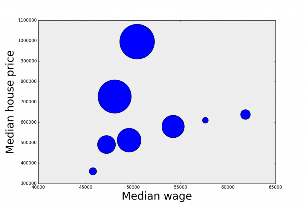
scatter = ax.scatter(med_wage, med_house_price, s = area)
ax.set_xlabel('Median wage', size=30)
ax.set_ylabel('Median house price', size=30)
plt.show()Good work! Here’s our scatter plot, the dimension of each bubble is proportional to the population of each city. But, hang on, I promised you to customise the colour of the dots and I haven’t done it yet!
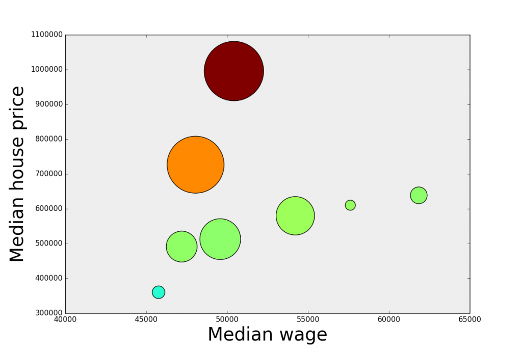
For that we need to make a little detour and write a simple function. We want to colour the bubbles to reflect the ratio between median house price and median wage. High ratio means expensive houses (compared to the wage) and low ratio means more affordable houses.
So we want to associate a colour to each value of the ratio. For that we want to pass an argument to the pyplot.scatter function that contains the list of colours in hex format. Here’s the function we use:
def array2hex(array, colormap='jet'):
    ''' Convert a normalized array 0-255 into an hex value of the color
        according to the given colormap.
        array: numpy array
        colormap: string
    '''
    cmap = plt.get_cmap(colormap)
    #get rgb values
    rgbvalues = [cmap(int(array[i])) for i, elem in enumerate(array)]

    #get hex values
    hexvalues = [colors.rgb2hex(cmap(int(array[i]))) for i, elem in enumerate(array)]

    return hexvalues
And then we compute the colours list by passing a normalised version of the ratio to our function
colors = array2hex(np.array(ratio)/max(ratio)*255, colormap='jet')Finally, we just pass the colours list as an argument to the scatter plot command. The rest stays the same.
scatter = ax.scatter(med_wage, med_house_price, s = area, c = colors)So far so good. What we have now is a matplotlib bubble chart. Now we are going to use mpld3 to make it interactive. We want to be able to click on each bubble and display the relative information.
To make the chart interactive, we are going to build a HTML table containing the information we want to display, in our case just the city name and its population.
# Start with an empty list
labels = []

# Loop over the index of the city
for i in range(len(data.index)):

    # Extract the value of the second column, which in our case is the population
    # and transpose it
    label = data.ix[[i], 2:3].T

    # Label it with the city name
    label.columns = [data.City[i]]

    # append it to the list. str() remove the leading 'u' in the unicode output of .to_html()
    labels.append(str(label.to_html()))
Finally we pass a bit of CSS to define the appearance of the tooltip, and associate the tooltip to the chart. The last step is saving the chart as HTML.
# Define the css
css = """
table
{
  border-collapse: collapse;
}
th
{
  color: #ffffff;
  background-color: #000000;
}
td
{
  background-color: #cccccc;
}
table, th, td
{
  font-family:Arial, Helvetica, sans-serif;
  border: 1px solid black;
  text-align: right;
}
"""
# Define the html tooltip associated to the scatter plot, pass the labels and the css
tooltip = mpld3.plugins.PointHTMLTooltip(scatter, labels, voffset=-20, hoffset=20, css=css)

# Connect it to the figure
mpld3.plugins.connect(fig, tooltip)

# Save it as html
mpld3.save_html(fig, 'chart.html')
Here is our interactive chart
| Cookie | Duration | Description |
|---|---|---|
| cookielawinfo-checkbox-analytics | 11 months | This cookie is set by GDPR Cookie Consent plugin. The cookie is used to store the user consent for the cookies in the category "Analytics". |
| cookielawinfo-checkbox-functional | 11 months | The cookie is set by GDPR cookie consent to record the user consent for the cookies in the category "Functional". |
| cookielawinfo-checkbox-necessary | 11 months | This cookie is set by GDPR Cookie Consent plugin. The cookies is used to store the user consent for the cookies in the category "Necessary". |
| cookielawinfo-checkbox-others | 11 months | This cookie is set by GDPR Cookie Consent plugin. The cookie is used to store the user consent for the cookies in the category "Other. |
| cookielawinfo-checkbox-performance | 11 months | This cookie is set by GDPR Cookie Consent plugin. The cookie is used to store the user consent for the cookies in the category "Performance". |
| viewed_cookie_policy | 11 months | The cookie is set by the GDPR Cookie Consent plugin and is used to store whether or not user has consented to the use of cookies. It does not store any personal data. |