Hi everyone, and welcome back to another data visualisation tutorial. Today we’ll describe another visualisation that is available with Plotly for Python. We’ll show how to create interactive choropleth maps with Plotly for Python.
In a previous post we explained how to make interactive scatter plots. This time we are going to build a choropleth map. That’s right, another mouthful! Let’s look at what the choropleth map page of Wikipedia tells us (well, we’ve simplified it a tiny bit …)
A choropleth map is a thematic map in which areas are shaded or patterned in proportion to the value of a statistical variable.
Alright, the gist of it is that choropleth maps are used to display data on maps. For instance, say we want to display the population of different countries. What we can do is read the data from a database and produce a map in which the areas of different countries will be darker the larger the population of that country.
In this example we are going to do something very similar. Instead of population data, we’ll use publicly available data on world health statistics in 2017, available through the website of the World Health Organisation here.
We collated the data in a handy csv file, and added the country ISO ALPHA-3 codes. If you would like a copy of the csv file, just give us a shout.
And here’s the code to make an offline maps with Plotly for Python.
import pandas as pd
import plotly
# Read data
df = pd.read_csv('who2015-life-expectancy-red.csv')
# Read values of axes
life_exp = df.iloc[:,2]
health_exp= df.iloc[:,3]
# Define the data to be visualised and some of the parameters of the visualisation
data = [ dict(
type = 'choropleth',
colorscale = 'Rainbow',
locations = df['Code'],
z = life_exp,
text = df['Country'],
colorbar = dict(
title = 'Years',
titlefont=dict(size=25),
tickfont=dict(size=18))
) ]
# Define layout
layout = dict(
title = 'Life Expectancy at Birth',
titlefont = dict(size=40),
geo = dict(
showframe = True,
showcoastlines = True,
projection = dict(type = 'equirectangular')
)
)
# Plot
fig = dict( data=data, layout=layout )
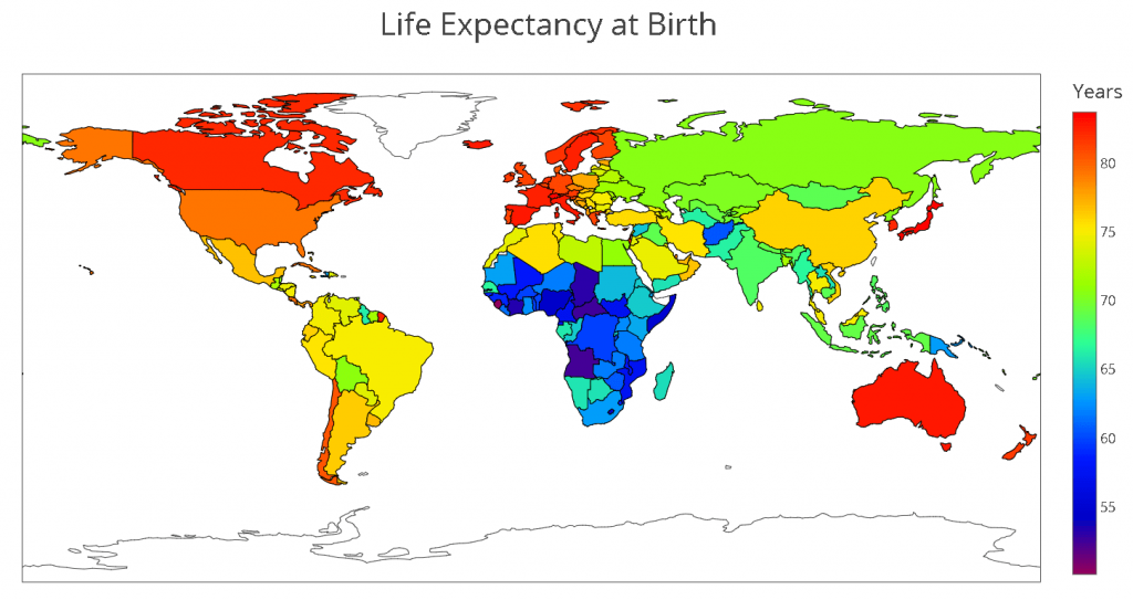
plot_url = plotly.offline.plot(fig, validate=False, filename='world.html')Here’s a screenshot of the result
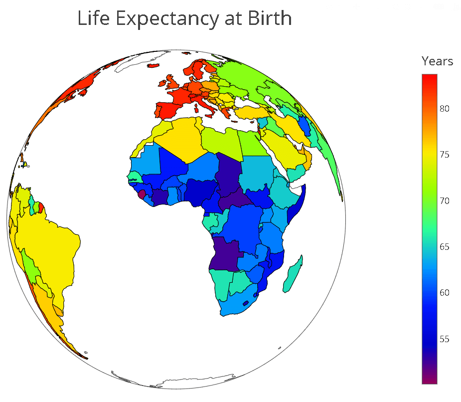
You can play around with the parameters to get different looks. For instance you can decide to change the projection type.
projection = dict(type = 'orthographic')To get this look
Well, thanks for reading this and until next time!
| Cookie | Duration | Description |
|---|---|---|
| cookielawinfo-checkbox-analytics | 11 months | This cookie is set by GDPR Cookie Consent plugin. The cookie is used to store the user consent for the cookies in the category "Analytics". |
| cookielawinfo-checkbox-functional | 11 months | The cookie is set by GDPR cookie consent to record the user consent for the cookies in the category "Functional". |
| cookielawinfo-checkbox-necessary | 11 months | This cookie is set by GDPR Cookie Consent plugin. The cookies is used to store the user consent for the cookies in the category "Necessary". |
| cookielawinfo-checkbox-others | 11 months | This cookie is set by GDPR Cookie Consent plugin. The cookie is used to store the user consent for the cookies in the category "Other. |
| cookielawinfo-checkbox-performance | 11 months | This cookie is set by GDPR Cookie Consent plugin. The cookie is used to store the user consent for the cookies in the category "Performance". |
| viewed_cookie_policy | 11 months | The cookie is set by the GDPR Cookie Consent plugin and is used to store whether or not user has consented to the use of cookies. It does not store any personal data. |